
Great website copy is like having the perfect sales pitch – it matters, but not if your store is impossible to navigate. While snappy messaging catches attention, it’s the user experience (UX) that keeps visitors around. If you aren’t converting website visitors into buyers, your UX might be the sneaky culprit sending potential customers running for the exit.
First impressions matter. Website visitors make instant decisions about staying or leaving based on visual appeal, credibility, usability, and findability — it’s a quick gut check that happens in seconds.
If your home page isn’t appealing, it’s highly unlikely a visitor will progress any further. In fact, studies have shown that great design and high usability can increase website conversion rates by as much as 400%.
5 reasons why your website traffic doesn’t convert
You might be tempted to save money on design or website structure, thinking no one will notice. But here are five key ways that bad UX can actually work against your website conversion rates.
1. Confusing Navigation
The Problem: If you’ve ever wasted time clicking around a website searching for the piece of information you need, you know how frustrating unclear navigation can be to user experience. A poor navigational experience inevitably leads to high bounce rates as users abandon their search — and your business — altogether.
The Solution: To optimize for conversions, it’s important to streamline navigation by using intuitive labels, organizing content hierarchically, and minimizing the number of clicks it takes to reach key pages. Just because you intuitively understand the logic of your site and products, it doesn’t mean first-time users will.
2. Weak Hero Sections
The hero section is the first thing every user sees on every webpage. For the uninitiated, the hero section is the main feature that shows up on your home page and key landing pages under the logo and menu.
The Problem: Many people waste a great opportunity to convert website visitors into sales by fumbling the ball on the hero section. This largely happens because they don’t understand its purpose. A user’s first impression of a website is 94% influenced by design. If you take a look at some high-converting website examples (later in the blog), you’ll notice that the hero section is clear and visually appealing. Your hero section should give the first indication of:
- Who you are
- What you offer
- What the user should do next
If your hero section fails to adequately communicate this information — whether because the hero section isn’t prominent enough or entirely non-existent — users are likely to lose interest and leave without bothering to continue scrolling down the page.
The Solution: My tip for a strong hero section is to make it front and center in the design, keep the messaging simple and direct, and include a clear CTA. People need to know why they’re on that page, what they can get out of it, and where to go to get it.
UX design website Justinmind
3. Lack of Social Proof
The Problem: No social proof (AKA “reviews”). Businesses use customer reviews, testimonials, or case studies to prove to prospective buyers that their product/service is as good as they claim. Without social proof, visitors to your site may not even realize it, but they lose confidence in your brand. Want proof?
- 84% of B2B buyers leverage review sites, according to the 2023 G2 Software Buyer Behavior Report. This highlights the importance buyers place on social evidence of your products and services.
- 98% of respondents asserted the importance of reading reviews before making a purchase, per a recent Gartner survey.
- B2B users are statistically more likely to trust indirect sources (like their peers) than direct ones (like vendor sites).
The Solution: If your brand has social proof, it’s important to include this content high in the design hierarchy of your homepage if you want to convert website visitors into sales. Prominently showing off positive customer reviews, including customer logos, or linking directly to a new case study will give you more credibility and encourage users to keep engaging.
UX design website Justinmind
4. Unclear or Missing Calls-to-Action (CTAs)
The Problem: No CTA. If you don’t tell the visitor what you want them to do, you can’t get upset when they don’t do anything. A call-to-action, when done well, gives users a clear next step down the sales funnel and helps you optimize for conversions. It’s important that you make the path forward as obvious as possible, whether it’s:
- purchasing a product or subscription
- signing up (get started)
- scheduling a demo
- watching a sales video
- downloading a brochure
- requesting pricing
The Solution: Make your CTAs action-oriented; primary CTAs should guide users toward conversion goals, while secondary CTAs support alternative paths, such as learning more. On the page itself, buttons and contextual links should be placed strategically throughout the content to support different conversion goals depending on where a user is in the sales funnel.
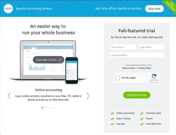
Xero
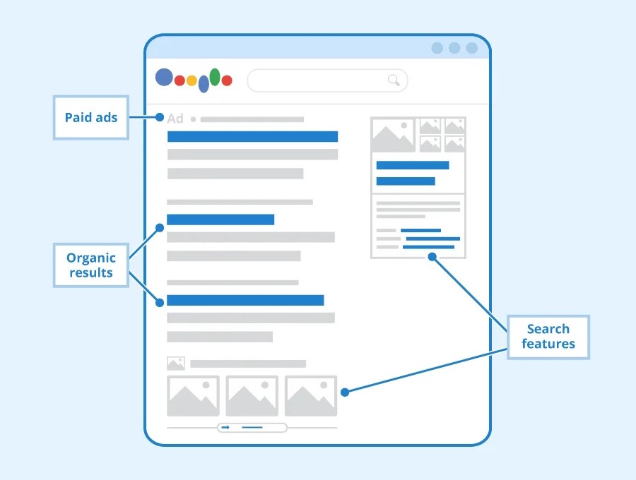
Related: What is a contextual link? Contextual links connect keywords or phrases to related content. It’s an SEO technique where you link to helpful content either within your own site or on other websites that your audience would benefit from.
5. Inadequate Value Propositions for Funnel Segments
The Problem: When designing websites, a huge challenge is creating an experience that applies to every user regardless of what stage in the sales funnel they’re at. That means ensuring you have value propositions that are not only specific and compelling but also effectively address the unique needs of prospects in the following three stages:
- Awareness
- Consideration
- Decision
The Solution: Buyers in each category need to be courted differently in order to get to the next step. Additionally, you need to make sure these value propositions are in the correct order. You’ll notice that the most successful web pages (more or less) implement the following user experience elements in a consistent formula:
- Top navigation menu
- Hero section
- Social proof (customer logos, testimonials, or reviews)
- Overview / About section
- Features or benefits section (displayed in a Z pattern)
- CTA section
- Footer
This tried-and-true formula guides buyers through the logical journey that will ultimately lead them to click, buy, and convert.
High converting website examples
Want to know how to optimize for conversions? Sometimes, a picture’s worth a thousand words. We’ll leave you with some high converting website examples to mull over. (Full transparency: we designed and developed them all.) Compare them to your own and see if you can spot the differences.
- https://www.i2290.com/
- https://compliancebridge.com/
- https://www.opsninja.com/
- https://ashoreapp.com/
For stagnant websites, doubling down on user experience elements is one of the best ways to improve SEO and boost your bottom line.
If your website’s UX or messaging isn’t crystal clear, or doesn’t align with your sales approach, our Keyword, Content, & UX Conversion Roadmap can turn those confused window-shoppers into actual customers who, you know, buy things.